All Business & Blogging Posts DIY Day Planner Design
February 21st, 2013
My Self Care & Freelance Friendly Planner Design & A Free Printable Planning Sheet
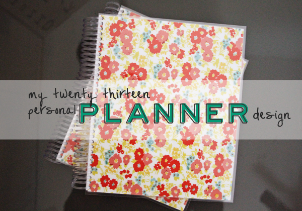
It’s not a secret that I’m an organization junkie. I love beautifully designed file folders, agendas, lists and stationary… don’t get me started! I’m on a card kick at the moment. Aside from my laptop, the organizational tool that I work with most is my day planner. I’ve blogged about using a Filofax planner, making my own planner from scratch (part one & part two here), and making a planner from a Moleskine notebook (no biding required!). So when 2013 rolled around and I’d already tried so many options I wanted to try the one I hadn’t tackled yet: designing my own planner and have it printed and bound for me.
I went this route rather than buying a planner because I wanted a challenge, and because I wanted a two pages per day layout that gave me space to make lists and track my work time as well as a daily view to plot out appointments and client calls.
I also wanted a planner that had self care built into its DNA, which I hadn’t been able to find. I imagined this would look like a daily reminder to take care of myself (working on it!) and a place to track how much sleep I’m getting and how that correlates to my mood. This is a huge part of how depression and anxiety affect me, and having a visual way to track them in my planner helps me remember exactly how well I feel the day after a Downton Abbey marathon gets out of hand and goes past midnight.
These were the results!
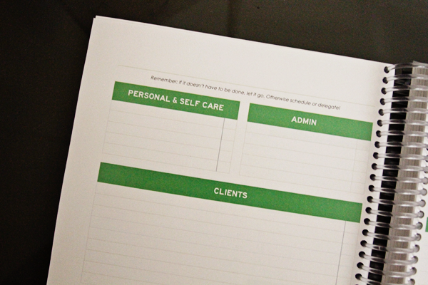 Left Page: These are areas for my client work, things I’m going to do for myself, and admin work for Freckled Nest Design. The note at the top reads “Remember: If it doesn’t have to be done, let it go. Otherwise schedule or delegate”. I always seem to need a reminder that putting something on my To Do list is a choice, not the default!
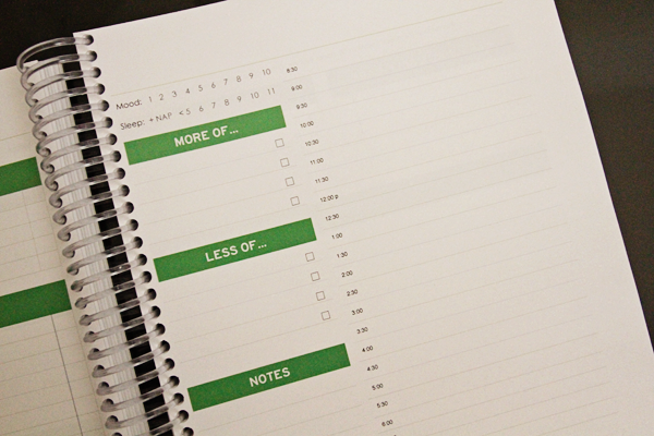 Right Page: My mood & sleep tracker, and “More Of”/”Less Of” sections for keeping my intentions for that day in mind (Note: This was inspired by a planner I found when I designed this in November but can’t find now, if you come across it please send me the link!). On this page there’s also a daily overview by the half hour, and I write the Month and day of the week at the top corner of each page.
Wonder what it looks like in action?
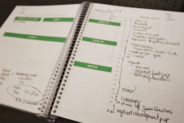
This “action shot” is from a time when I was working on a client launch while my husband was traveling, which is why I have 15 mins of FaceTime listed and work until 11:00 pm. These days I usually wrap up work at 6 pm, and instead of FaceTime we have real face time!
So far I love this system. There’s lots of room for notes and sticking with my intentions, and every day is a fresh start. It’s designed to fit a legal page that’s cut in half and the only downside so far? It takes up two books!
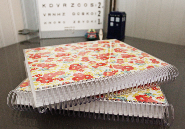
I have six months of the year in each book, and it became much more affordable when a lovely lady at my neighborhood copy center charged me for letter sized paper instead of legal sized paper and let the mistake slide. Thank you, error margins in giant corporate budgets!
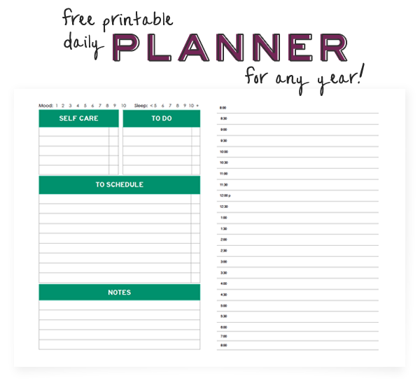
Since I wanted to give something back but couldn’t ship out boxes of these babies, I thought that a printable version inspired by my planner design would be a way to share some of the organization love…
Click here or above to grab yours!
Note: This is a free download for personal use only.
The headings are in the Pantone colour of the year for 2013 (excuse me while I adjust my glasses), I’ve kept the self care prompts in and added a short to do list along with a bigger “To Schedule” area where you can pop in things that come up during the day without automatically making them your next top priority.
I hope you enjoy this free printable!


This is so clever of you!
I’d love my own – between three jobs and two cities I’ve resorted to drawing out my week on two pages in a blank notebook and we share a Google Calendar.
I’d love one of your creations (if only to make sure I had a little time for me) but some of the comments above are far more deserving x
I have always been so envious when I see your handmade planner. I would like a planner to organize/plan out my blog, fitness and personal stuff. Right now, it all goes in one planner and I just write in different colours to distinguish the categories.
Kyla! I love your annual posts on your planners – you actually inspired me two years ago to get into binding my own notebooks!
I’d love some kind of planner solution for blog planning. Actually, I’d love to combine personal life planning + blog planning into one book. I have yet to find a good solution for that.
Thanks for sharing your 2013 planner!
Holy organization. Does the sleep part really help you?
xo Ashley
luckylittlebird.blogspot.com
Honestly Ashley, after paying attention to it for a couple of years, I’ve found it’s actually the biggest thing that impacts how I feel day to day. I’d heard from doctors that it can impact you mood, but I didn’t realize how much until I started experimenting with it. Figuring out how much sleep you work best with is a simple trick with a big pay off :)
Hi Kyla! I LOVED seeing me penciled in there! that made my day :)
I need help planning when it comes to doing all the amazing fun crafty stuff on things like pinterest with my kids. So many seasonal fun things, along with making cupcakes and cakes too. A great planner would keep me on track to stay on time!
thanks :)
Kyla you are amazing! I might also be a little bit obsessed with organization and planning so this post totally rocked my world. I looove that you created your own planner with all of the right spaces for all of the right things! I swear I’ve wished for the same thing a million times.
Right now I use my google calendar to track all of my different projects, but my in hand, nice, heavy pretty paper planner is so much better… I just can’t fit everything in it in a nice, organized way (editorial calendar, day job, race training, personal plans). I end up using gcal, my things app, and my paper planner simultaneously and its a bit of a mess.
I could use some ideas! I am so looking forward to this feature. :)
Thank you for finally posting this! I’ve been waiting and waiting, hoping you’d post your next planner idea/purchase/DIY project and I’m so excited to see this!
I agree with the others about a blog planner, as it is hard to stay on task, brainstorm, plan around holidays, etc. I’d love to see something that captures writing ideas, daily planning, theme planning, how to better your blog planning, etc.
Even more important to me, though, would be a travel planning page/planner! I travel every four to six weeks to a new country or city somewhere in Europe for work and I’d love to plan better. I’ve been doing this for three years straight and still, 12 hours before I get on a flight, I dump everything I own in a suitcase unfolded and go. No luggage tags, no country tips, no suggested restaurants or contact info, no clothing list or To See list, etc. Country tips, to Do lists, daily schedule, work schedule, fun schedule, photos MUST TAKE list, exchange rate, currency, time zone, language, people to meet, reviews to write, experiences to have and share, etc are all so many important things to me that I often forget to do/note/get to when I get caught up in work or wine. :) A travel planner would keep me on track and help me capture details and moments I don’t want to lose and hope to share.
Thanks so much for your blog. You’re always so motivational and inspirational.
That planner is so pretty, and thanks for the download.
I’ve been unemployed (again) for 6 months now and I have to look for jobs I can get rather then I would love. Consequently I’m not 100% sure what I want to do anymore.
I would love something that would enable me to write down my hopes/dreams/goals and list the things I have to do to get there.
What a great idea! I’m very curious to see the different calendars that will a result of this :)
I think your idea of including a way of tracking mood and sleep is a great one. I personally would also include a little ‘reminder check list’ for positive things one tries to include every day, like exercise, get some fresh air, craft, take some time to relax etc and a section to to note down creative ideas.
I *love* your planner, and would be delighted to have you design one for me! I really love your approach to put more “heart” in your planning, for lack of a better way to put it… less emphasis on times and deadlines, and more of a focus of self-development. If you’re overwhelmed, you won’t get anything done. If you’ve got a plan and it has your wellbeing in mind, you’ll be much more inspired to pursue and complete.
At least that’s how I feel, anyway…
That being said, I’d love a planner that would allow me to separate my daily duties into things that I have to do for work, and inspire me to set aside time to do things that fulfill me — craft, yoga, cook, play video games, sleep in a little more. It would be a difficult task, as I usually get gung-ho about planners for about a *month* and then forget about them, but I’m willing to bet this approach will have a vastly different outcome. :)
Oh I LOVE this idea:) I am doing my Honours part-time this year so I reeeeeeaalllly need to start getting more organised! Definitely printing this out!!
Thanks plenty x
I printed off your freebie and started using it right away. I love the running list with time breakdowns – it helps me stay on task at work and write down what I DID, rather than sitting on a list of TO BE DONE. However, I wish it went a bit earlier in the morning, because I’m an early-riser morning yoga-goer. I also would love a bigger section for self-care. Your inclusion of mood and sleep is so great!
This is such an awesome way to give back to your readers, Kyla! I see a lot of planners and organizational tools for daily obligations and requirements, but very few that are dedicated to self-reflection and simply getting your thoughts down. I have a tendency to let my thoughts and feelings build up which makes me feel overwhelmed and anxious. I have been wanting to journal/brainstorm/just get writing to combat this, but I personally I have a hard time knowing where to start when I’m looking at a blank page.
Sorry for the long-winded back-story but essentially, I’d love to see a Kyla Roma-designed organizational page with a few prompts or designated sections for jotting down thoughts, feelings, and reflections. I’m pretty good at maintaining my scheduled activities, but I rarely carve out the time to reflect on how I’m doing and I think something like this would really help me to be more mindful of myself every day.
You’re the best!
Yes, I would love to have you create a planner for me. I am SO PICKY on planners and end up buying 2-3 a year which is obviously not effeciant
Wow, this is fantastic! I am having a very hard time with my Filofax, and I am finding that I use it less and less. I need an organizer that inspires me and demands attention, something diva-ish! The need to organize is extremely important to me. I would love a planner that is separated into sections that address a monthly calendar of events, to-do, and personal journal entries. I find that too many sections gets confusing! Short and concise works best for me.
Really love your blog! :)
This year is going to be a crazy one, working on opening my brick-and-mortar shop, juggling writing gigs and making time to pursue that weeks passions. I’m definitely a dreamer, a curious-minded person that loves to try a little bit of everything. Instead of treating that part of my personality as some sort of weakness, I’m learning to embrace it. Because when I do embrace it, I’m so much happier! I tend to break my day (and my life, really) into three parts. DO, DREAM, and CREATE. The DO part of my days are spent with my current responsibilities and duties, DREAM is the time I take to invest in future things I want to see happen and CREATE is the time I make for things that are creatively fulfilling to me like sewing or browsing Pinterest. I’d love to have a planner that breaks the days down into three groups like that so I can be visually aware of whether or not I’m making time for all those things. : )
Congratulations, Amanda- you won the giveaway!! I’ll be connecting with you by email, I’m excited to see what we come up with. Your idea is great! :)
A planner like this would SAVE MY LIFE when work gets crazy over the summer. I need to manage 5 people (starting this month) and then I’m indirectly responsible for the 5-6 people they’ll each manage. Once May hits I ALWAYS end up sleeping 3 hours or less and not keeping up with my self care. If my work planner also forced me to remember my personal goals, quint commitments, and habits… My summer would be WILDLY better. xoxo! – DiFi
I love planners and organizers! This is such a great idea and thank you for making it available to download. I will definitely give it a try. I’m using a moleskine now but I do think it needs a little more customizing…this is quite inspiring. The best idea is including the section of self care!! thanks again.
I love this! If I had my own, I would love to have a planner that made it easier to schedule workouts, social engagements, and work / school assignments. I do love my Erin Condren planner, but having everything jumbled together is kind of confusing. I like how everything has its place on your planner, but it’s still accessible. :)
I love the amount of room you leave for notes, lists, feelings, more of, less of, sleep, etc. So cool and so cool that you’re offering this for free. In thinking about how I use my paper planner, I think I’d make a few changes for my own use. I’m thinking I would only carry one month at a time with me, but to address the need to plan well into future months, I’d want a one-month overview, where I could jot down future plans. That way, the bulkiness isn’t a factor, but the practicality of such a planner could be used! That said, don’t make those changes for me … my planner runs through the end of 2013 (speaking of, you should totally bring back this idea around October or November when most people I know shop for their “next year’s” planner!).
That planner is awesome! I’d love to see one all about healthy living / exercise. Maybe with some meal planning elements, workout or activity tracking, or even with a section dedicated to yoga/meditation/mindfulness. I’d buy something like that in a heartbeat!
I love this, Kyla! And what an awesome project to build custom planners for sharing! I love the Erin Condren planner, but always wished that instead of “day, afternoon, and night” sections, I could instead customize those to be “blogs,” “clients,” and “personal,” so I’d love to have something like that, perhaps with monthly goals at the beginning of each month for each of those three buckets.
I love this planner! Amazing job designing! I am also an organizational junkie.
One of my goals for this new year is to get a better handle on my young business! I’m trying to get a lot more organized with blogging, creating, selling, being a work at home mom, etc.
This is the first time I’ve had this much on my plate, so to have some help in organizing it from someone as talented as you would be amazing!
Thanks for your beautiful blog. I recently found it and am glad I did.
Very cute, Kyla. I love your style. It’s easy on the eyes and very well organized.
I’d love a custom piece that helps me keep track of a daily to-do list and brain storming room for blog posts and projects.
xo
I’d love something very similar to your planner pages! A custom planner sounds amazing! You’re so creative and organized. I love it!
I would love to have something that would keep me organized for the day. I love checklists. I also love the idea of having an organized menu and meal planner. I use old envelopes for grocery lists and menus. I am stylish that way!
Wow this is lovely. I am definitely going to use that printable, thanks for sharing! And what a nice giveaway to design something…. I am looking for a way to organize all my loose recipes! Right now I just print stuff off the computer or write it on scraps, and stuff inevitably gets lost! It is fine and dandy to save stuff to a pinterest board, but my computer is not in my kitchen and makes it hard to follow off the screen :) Thanks so much Kyla!
Thank you so much for the freebie! I am going to try it.
It’s funny how we keep organizing everything and still get lost with all our to do’s and other affairs.
I’m a lawyer and have to keep track of work projects, hour to log onto timesheet, managing a household (and some cats) and I would love if you could design something that could help me keep up with all that in one single organized space. For now, Icreated a method through which I keep 2 planners and 2 moleskines. It’s so confusing (and heavy to carry in a purse all day)…
I love your planner and the headings you used!
Kyla.I would love love love to win a planner..my dream planner would be one page that shows a entire month that I can track & see all my fitness related information. I would find that highly motivational to be able to see all my scheduled workouts (sometimes more than one in a day!), calories burned, time exercising,how much water I drank etc. Right now I am using a combo of apps & my weekly daytimer..but a month at a glance would be PERFECT!
Anyways..I ramble..lol!
Have a great day, so nice to see a post from you!
I love when worlds collide! I have been reading your blog for years and today, as I was reading your planner post, I saw that your agenda including working on “Unglued”!
I live in Moorhead, Minnesota and I love a local shop in Fargo (right across the river) called Unglued. They have an amazing store and host the best craft fest in the area. I had noticed on their site that it was a Freckled Nest Design! So cool to see my favorites come together!
Wow! I love the planner page, thank you!
I’m just like you – an organizing geek. :)
What a great idea!!! :D So smart! I’ve been buying Moleskine planners, but they’re not quite what I’m looking for… I have been “customizing” mine as much as possible, but THIS may be an excellent option! I <3 organization. A lot. I have lists all over!
I work full time and am a full-time grad student and TA, so I would LOVE something that allows me to schedule both work To Dos and my school work/readings/projects, as well as the planning I need to do for my discussion groups. Not to mention the self-care bit – I often forget to take time for me, because it blends in (and can easily be crossed off) of my to dos.
I have been trying to find/create the perfect planner for me forever! I need to do list, in the 4 quadrant style urgent/important, not urgent/important, urgent/not important, and not urgent/not important. Schedule, but I don’t have too many appointment times, so maybe just morning, afternoon and evening. I also need to track exercise and mood as related to food and sleep. Inspiration would be great too and a way to see long term goals in a clearer way.
So much in my head! It needs to be sorted out and decluttered in a clear and pretty way :) :)
Love it! (Especially because I didn’t get a lot of sleep last night, so I’m a tad grumpy!) I use a Filofax Personal and really want replacement pages for the planning pages that include to-do items and a meal planner. I’ve been looking forever and am still surprised that nothing like this appears to exist!
Such a cute planner! And it really looks like you get the most out of custom pages. That’s one of the things that drives me crazy about my current planner – I feel like so much of it gets wasted because it doesn’t suit my daily needs 100%
A daily running to-do list that’s simple to keep me organized with tasks would be a must, a place to plan for upcoming and weekly school assignments, one that I could use to jot down meals, reminders, long-term personal projects, and also double as a blog posting calendar would be ideal.
Your planner is amazing. I’m always experimenting with ways to stay organised but never quite find the correct way.
I would love a blog editorial calender – a way to look ahead so I can see annual events that blog posts need to planned around (christmas, Valentine’s, Pancake day), reminders to do my features every week, a brainstorming area, posts that need to be written and also things that need to be done before these posts can be live!
Oh, this is just darling! I remember your totally made from scratch planner, I think I gave it a go myself but in the end had to concede that I don’t use paper planners very well!
A master monthly calendar would be fabulous, to use as a blog editorial calendar- a quick snapshot of when I plan to publish particular posts, so that I can factor in the necessary preparation into my daily plans!
This is beautiful. You have great talent!
I would love to have a creative planner for my business to schedule events, as well as creative content ideas, i.e. blog posts, tweets, contests, etc. It would also be fabulous if it could track trends and customer feedback for the month (what colours, styles, lengths, days, prices, etc. were popular? what did customers have to say?)
I have an image mapped out in my mind, and was just planning on using excel (boring), but this would be much prettier! :)
How fricking cool and generous! I do a lot of sewing and would love some sort of planner to keep track of fabric/patterns/project plans, maybe something that could be adapted to other crafty pursuits too :)
AMAzING PlANNER! i love the little details like mood etc and times for things i am always jotting down on notepads so would be great to have it all together!
I would like a creative planner piece, to track my photography, sewing, making generally like crochet and knitting. It would help me focus and complete projects but also show progress over time, as it’s all too easy to forget this.
Barnicles x