May 5th, 2015
How I increased my Pinterest impressions by 240%
Let me tell you something you already know: Pinterest is a force of nature. Since it joined the scene, social media has rapidly evolved to emphasize eye-catching images, making visual content more important than ever to bloggers, artist, and creative entrepreneurs.
I’ve had a lot of fun and success on Pinterest, gaining a following of over 140,000 users in just over a year. But that success has been lopsided – while I get great referral rates on my old Craft and DIY posts, my new posts lag behind. And if my current work isn’t being seen? My Pinterest following really doesn’t help me much.
So lately I’ve been on a mission to learn what makes the perfect pin!
It’s like Captain Ahab and his white whale, only with more mason jars and less seafaring.
Now that my business is focused on helping bloggers and small-business owners, I’m making sure those posts reach Pinterest too. And I’m challenging you to join me.
Today I’ll share the principles that I started using two posts ago, and that I’ll continue to use in the coming months. So far they’ve had amazing results and (you know me!) when I find something that works, I’m excited to let you know about it.
What do you think; are you in? If so, pin this post for reference and then keep reading to learn how to take Pinterest by storm!
Our first mission: learn what Paula Deen knows about Pinterest
Sadly, there’s no butter involved, but if you need to pause to make cookies in her honour, I’ll wait for you.
Back? Perfect!
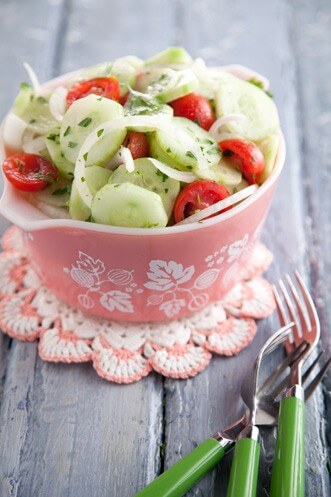
This image from Paula Deen’s website is one of the most pinned images on Pinterest, and based on extensive data analysis from 2013, it demonstrates a damn-near perfect storm of what works best on Pinterest.
Let’s break down what works in this image, and many other popular images, so you can start using the same techniques for your posts.
Pinterest keeps it light. (Just not too light.)
Images that are bright and balanced in their lighting do very well on Pinterest. You don’t want dark or overexposed images, unless you don’t mind less sharing and interaction.
Lesson: Choose images that are well lit over dark ones, and make sure your monitor is adjusted to full brightness when you edit, to make sure you’re really seeing all the changes you make.
Pinterest likes its pictures lanky
You probably know this one already, but it bears repeating: images that are portrait style rather than landscape receive much more attention from Pinterest users. This is because of the design of Pinterest’s layout, which makes vertical images stay visible on screen longer as users scroll. That means taller images naturally command more attention. This is actually a big part of the reason that infographics have been so popular in the past few years.
Lesson: Maximize your screen time! Make your images at least 1.5 times taller than they are wide.
Pinterest rewards warmth
Images with warm colours (that’s photography speak for more yellow toned) perform better than images that are cool (photography speak for blue toned). Pinterest users are more likely to click images that feature oranges, yellows and browns. Predominantly blue images tend to receive less engagement from users.
Lesson: Choosing colours for a blog photograph? Pick images with warm colours over cool tones, and if you colour correct, you can experiment with tipping your images into a slightly warm tone to see if that impacts your analytics.
Pinterest keeps it colourful
We’re so used to seeing colourful images on Pinterest now that we look at them without really seeing what they have in common. If you look at your feed, you’ll probably notice that many of the images you see have multiple dominant colours.
Consider the Paula Deen image above: there’s red in the strawberries, grey/blue in the table, and green in the fork handles. Now that you’ve studied the image with a critical eye, it’s easy to see, right? Take a look at your feed with that eye – how many images do the same?
Lesson: Look for opportunities to pull in multiple dominant colours when you take pictures for your blog, and when you select stock images to use in posts.
Pinterest wants us to keep our selfies to ourselves
If you’ve heard that Pinterest users don’t respond well to pins featuring people’s faces, that finding came from the 2013 study. Researchers believe that people go to Pinterest to find products and solutions, so pins that feature portrait photography will have less engagement.
Lesson: When choosing images that feature people, don’t make their faces the focal point of the picture. For example, people facing away from the camera or other crops are well received. And for what it’s worth, remember that this data is based on averages, not hard-and-fast rules. There are always going to be rule breakers.
Pinterest wants to get up close & personal
Pinterest users respond strongly to images that are a close crop of the subject, where there’s less than 30% open background in the image. They are drawn to images with details – either there’s a lot going on in the photo, or they can get a closer look at a product.
Lesson: Leave the white space at home! Make sure that photos prominently feature their subject, and don’t be afraid to crop an image to reduce background so its composition is more Pinterest friendly.
Take the mystery out of Pinterest and make it measurable
If you’ve been reading my blog for a while, you know that I love making it easy to understand what’s working for you and what’s not – and the first step toward that is to make your results measurable. None of this guessing stuff! Your Pinterest account and blog don’t need a soothsayer; they need data! I’m not a math person, and it’s not intimidating or overwhelming, I promise.
The fastest and most thorough way to get that data is to convert your Pinterest account into a Business Account. Luckily, you don’t have to be a business to do this; you just need to mean business about Pinterest, and if anyone asks? I’m vouching for you. You know I’ve got your back! A Business Account gives you access to a whole analytics dashboard, where you can see how your Pinterest account performs, and how pins from your website perform.
Lesson: Get down to business with Pinterest! Complete the steps to verify your Pinterest account and follow their process to add a tiny bit of code to your blog or website’s theme.
How I’m using this research to change my blog
I started experimenting with different image styles for my posts over the previous few weeks, and you can see an example below. At first I was just being playful with them, and developing a different approach to Pinterest. But after a little while, my inner Ms. Frizzle got the better of me, and I jumped into research mode.
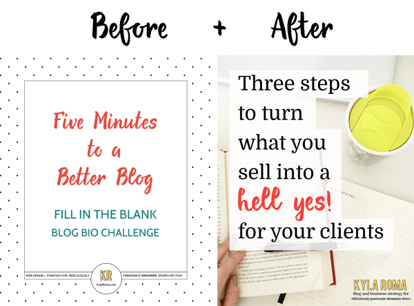
I chose images that are closely cropped to their subject and that feature a warm colour of text and use warmer colours if possible. I’m more aware of choosing multiple dominant colours – I find myself seeing them when I wouldn’t have identified them as part of an image before, and I’m sure that’s playing into my choices. I’m looking for images that are light and well balanced, but I’m not ruling out the use of darker photos if they’re interesting.
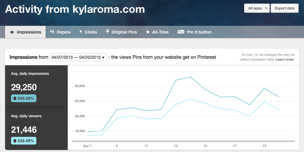
To make it measurable, the stats I’m watching in my Pinterest Analytics are impressions (the number of times my pins are viewed), clicks (most important! This is when someone clicks to read more) and original pins created by readers like you (when someone clicks the “pin it” button on an image on my site).
I’m going to keep applying these ideas to my posts through May, but after using these new images in mid-April, the daily impressions for my pins have increased by 240%
See? Didn’t I say Pinterest was fun?
When you can measure your results, you can stop guessing and worrying. Instead, you can be playful, try new things, and effectively run experiments with no downside, because all the results will give you information that takes you one step closer to an even more dynamic online presence. While a strong Pinterest presence is a badge of honour for designers of all stripes, as well as bloggers, makers, and professionals in visual fields, for small business owners, the upside is huge.
Combine your style with a diligence to checking how your tests perform. Adjust as needed, and it will be easier to make a living, become more exciting to your readers, and take advantage of the incredible opportunity that Pinterest and its over 200 million users represent.



Hi Kyla,
May i know what exactly are impressions as am new to Pinterest?
Thank you & best regards,
Cheryl
Great insight on how to increase Pinterest impressions! Thanks :)
Thank! Very useful analytical research in this area. I will try to put your advice into practice.
I would definitely use your statistics as your guide – a purely black and white photo would definitely stand out in the feed! If that’s working for you, I would keep trying ways to explore that. Your numbers are always your best guide :)
Excellent and informative Kyla. Thanks for sharing :)
That was a really exciting read. Excellent info, almost half of it is completely new for me. I am in the early stages of Pinterest Profile building, I am sure this is going to help me in exploring it further
Thanks Kyla !
Thank you for this great information!! Do you mind if I ask what photo editor you use to add your text to the pictures?
Definitely trying a few of these tips! I know there is a whole world of Pinterest that I haven’t tapped into yet. The first thing I really need to figure out is verifying my site, but otherwise I’m all set! Thanks for such an awesome post!
Thanks Nathalie, I’m glad it was helpful. Have fun diving into Pinterest! If you haven’t verified your site, see if you can make time tonight. It’s one of those things that can slip through the cracks. Thanks again for commenting!
Kyla, I am trying to understand “impressions”. How does Pinterest determine if they are going to show your pin to your followers, and when they are going to do it. A few months ago my steadily rising Pinterest referrals took a nose dive and I can’t get them to budge. My impression rate (according to analytics) is down 33%. I am desperate to make changes to fix this. Nothing changed on my end, so I am wondering if there is a Pinterest factor in impression rate. Any help or insight you can offer would be greatly appreciated!!
I’ve been working on doing better on Pinterest lately. I’ve been making slow but steady progress. I’m going to have to try a few of your tips that I haven’t been yet.
Thanks for commenting, Fiona! Just that you keep experimenting and trying new things, and seeing how they work is such a head start. Keep it up & let me know what works best for your audience!
This is great! I still don’t use Pinterest personally but I do for work and am definitely giving the contrasting colours trip a whirl.
(PS – I think ‘solopreneurs’ on your homepage has a wee typo :)
Amazing insights! Most of these are tips I’ve never heard before and never would have thought of! Thanks for sharing. :)
Wow! Thank you so much for this post! I can’t believe that there are so many factors that affect how much attention your pins get on Pinterest. I will for sure need to keep these in mind!
Clara | colormepurpple.wordpress.com