September 20th, 2013
Client Spotlight: JodyGrimm.com
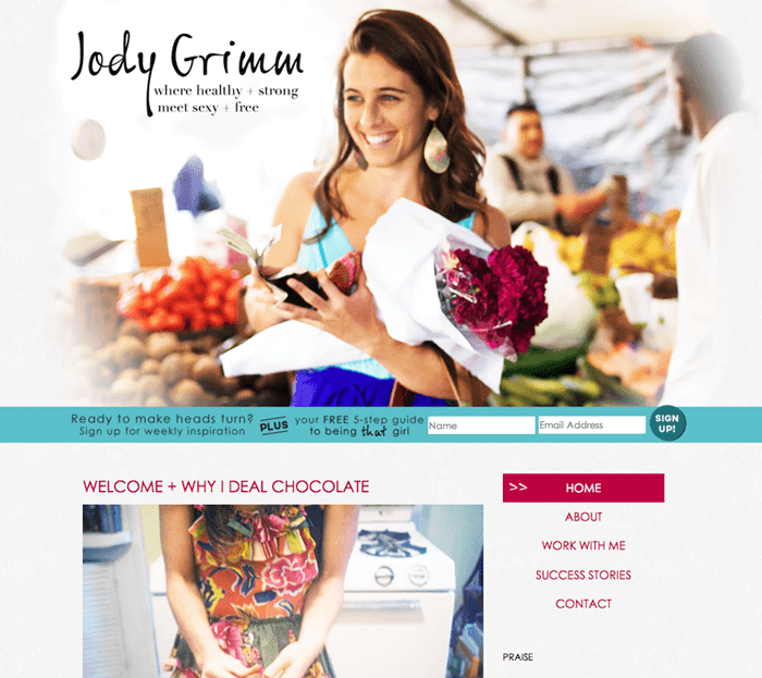
Jody Grimm found Freckled Nest Design when she was looking to change her business presence online to introduce herself to potential clients as a health and nutrition coach. She loved photography based websites and had arranged a photoshoot especially for the website to make sure she would have gorgeous new photos for her banner that could help clients make an instant connection.

Since Jody had come to the design process with a photoshoot we were able to use our favourite photographs as the inspiration for her colour story. This would make sure the design would look as at home, fresh and energized as the photography did. Because both the photography and Jody’s writing were so encouraging and positive we looked for fonts that would reinforce that feeling and complement it by referencing both her natural grace and hands on approach to each client.

We interviewed Jody about her design experience, and about the advice she would give to other business owners entering into the design process.
Why did you decide to take the plunge and get a new website designed for your coaching business?
I was really happy with my original site but I grew out of it. It was no longer a true reflection of me and my business. After over a year of coaching I’m clear about what it is I want to offer and what types of clients I most want to work with. A coaching client will ultimately choose who to work with based on the connection or lack of connection they feel with a coach – it was time for me to put more of myself into my brand and have a website that reflected that.
Were there any lessons you had learned from having a website for your other business that you took forward into this project?
I loved the simplicity of my first site and the focus on the photography – those were the two pieces of the site visitors also reported liking. My old site was not necessarily designed in the interest of business, though. It was a nice looking site but lacked the ability to update regularly and to keep visitors engaged. I knew moving forward I wanted the blog to be the most central piece of the site, I wanted visitors to be able to easily navigate through the different blog categories, to find the resources they needed, and I wanted visitors to remain on the site, to be engaged, to share with friends, to get into regular conversation.
Is there any advice to other small business owners that you wish you knew before you started a big project like this?
I would say don’t rush into it – get clear on your goals first. What is the main purpose of your site/your business? And then think about how you want visitors to feel when they are on your site. Most of the time I think the more simple, the better. Oh, and do a project like this when you have time to really dedicate yourself to it. You’ll be happy you did!
What was the most fun part of the design process?
Wow, well, it was fun and exciting most of the time! But I’d say the two most fun parts for me were
1. Identifying the details of my brand at the start – the colors, the fonts, the layout, the style – this was something I had never taken the time to do before and I actually learned a lot about myself in the process.
And 2. Of course, was when we were close to having the finished product! Seeing it all come together exactly how I imagined it would was such a cool experience :) Thanks to Kyla and the whole team – I couldn’t be happier with my new site!
Visit Jody’s site at JodyGrimm.com, and don’t forget to click around to different pages.
She has multiple banners featuring all those beautiful photos!

